 Bisrat Shibeshi
The best font for a resume is a plain, widely used one that's easy to read, at 10 to 12 points for body text. Serif or sans-serif makes little difference, so pick the one you like and use it consistently. For applicant tracking systems, the font matters far less than the file. In our test of 35 fonts, every PDF kept its text readable to software.
| Use | Recommendation |
|---|---|
| Body text | 10 to 12 point |
| Section headings | About 14 point |
| Your name | 16 point or larger |
| Margins | Half an inch to an inch |
| Number of fonts | One, or two at most |
| Fonts to avoid | Script, novelty and decorative fonts, such as Comic Sans |
Which fonts do career offices recommend?
Simple, common ones. Every career office we checked names a short list of everyday fonts and warns against decorative ones.
| Source | Fonts named | Body size |
|---|---|---|
| USAJOBS, for US federal resumes | Lato, Calibri, Helvetica, Arial, Verdana, Open Sans, Source Sans Pro, Roboto, Noto Sans | 10 point |
| MIT | Arial, Calibri, Cambria, Georgia, Helvetica, Times New Roman | 10 point or larger |
| Duke | Cambria, Calibri, Times New Roman, Garamond, Arial | 10 to 12 point |
| UK National Careers Service | Arial, Times New Roman, Calibri | 11 point or larger |
| Prospects (UK) | Arial, Calibri, Times New Roman | 10 to 12 point |
MIT's career office says to "avoid colorful, fancy, or stylized fonts", and Prospects says to avoid fonts such as Comic Sans. Consistency comes up as often as the font itself. Prospects asks you to "ensure all fonts and font sizes are consistent throughout", and Purdue's writing lab suggests using "no more than two fonts" on a resume.
Should a resume font be serif or sans-serif?
Either. Serif fonts, such as Times New Roman and Garamond, have small strokes at the ends of letters, and sans-serif fonts, such as Arial and Calibri, don't. Research on reading hasn't found that one is easier to read than the other.
A 2005 study in Vision Research found "no difference in legibility between typefaces that differ only in the presence or absence of serifs". The Nielsen Norman Group, which studies usability, calls the research "inconclusive". A 2022 study in ACM Transactions on Computer-Human Interaction found that each reader's speed varied by 35% between their fastest and slowest font, with no change in comprehension, and the fastest font differed from person to person.
The career offices agree in practice. MIT, Duke, the National Careers Service and Prospects all list both serif and sans-serif fonts. USAJOBS is the one source that prefers sans-serif, and it gives no reason.
Can applicant tracking systems read any font?
They can read any font when the PDF contains real text. The companies that build resume parsers blame failed parses on how the file was made, and none of them names a typeface. Textkernel, a parsing vendor, writes in its documentation that "the vast majority of problems in parsing are not from processing the plain text, but from conversion to plain text". Greenhouse lists the causes of failed parses as images, graphics, tables, columns, text boxes, headers and footers, and letters spread out with spaces between them.
We tested the fonts themselves. We took a fictional resume with 375 visible words and rendered it in each of OneCV's 35 fonts, 14 serif, 15 sans-serif and 6 monospace. Each version was printed to PDF with the same Chrome print settings OneCV's PDF service uses. Then we pulled the text back out with two independent text extractors, pdf.js (the PDF engine in Firefox) and Apple's PDFKit, and checked every word against the original.
- 23 fonts came back word-perfect in both extractors, and no font returned less than 97% of the words.
- No font produced garbled characters, broken ligatures or unreadable symbols.
- Hyphenated words such as "dock-to-stock" split in two wherever they wrapped at the end of a line. That depends on where the line breaks, so any font can do it.
- The only font-related problem came from two monospace fonts that have no true italic, Inconsolata and Overpass Mono. Our test template sets employer names in italic, and with those two fonts pdf.js ran each job title into the employer name below it. PDFKit read them correctly.
These extractors aren't applicant tracking systems, and each ATS uses its own. They do show that the font isn't what stops text being read. Whatever font you use, open your PDF and try to select and copy the text. If you can, the words are there for software to read.
Does the font change how long your resume is?
Yes. At the same point size, fonts take up different amounts of space, because their letters are different widths.
We measured the same resume text in each font at the same size. EB Garamond was 14.5% narrower than Roboto, and Work Sans was 12% wider, so the widest common font needs 31% more line length than the narrowest. Monospace fonts, where every letter takes the same width, ran up to 39% wider than Roboto.
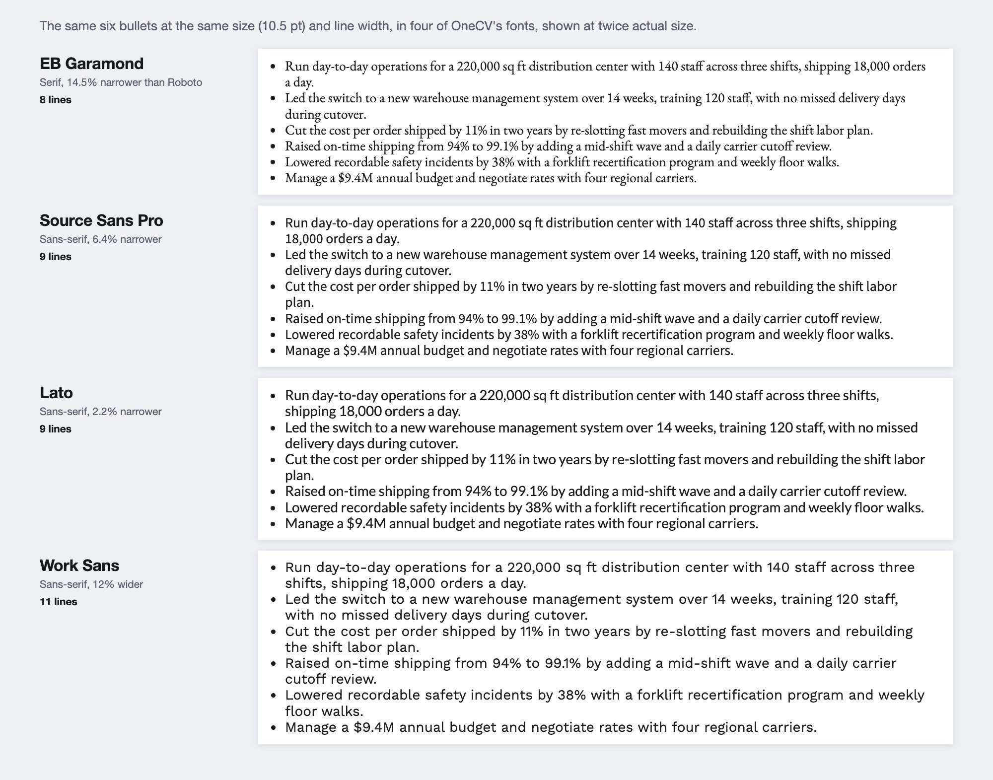
Narrow fonts save space partly by looking smaller. EB Garamond's lowercase letters are about a quarter shorter than Roboto's at the same point size, so 10.5-point Garamond reads like a smaller size of most sans-serif fonts. A 2018 resume handout from Stanford's career office suggests 11 to 12 point for small-looking fonts such as Times New Roman. If you switch to a narrow font to fit one page, check that it still reads comfortably, and our guide to resume length covers other ways to fit.
What font size should a resume be?
10 to 12 point for body text, around 14 for headings and 16 or more for your name. MIT says no smaller than 10 point, Berkeley suggests 10 to 11, and Duke 10 to 12. The UK's National Careers Service says 11 or bigger. For headings, USAJOBS suggests 14 point and Prospects 14 or 16, and Duke says your name "should be 16+ font size, in bold".
Judge the size by how the text looks on the page. A small-looking font like Garamond or Times New Roman reads better at 11 or 12, while a larger-looking one like Roboto or Lato reads comfortably at 10.
Is Times New Roman OK for a resume?
Yes. MIT, Duke, the National Careers Service and Prospects all list it. The idea that it looks outdated traces back to a 2015 Bloomberg article that asked three designers for their opinions and collected no data. One of the three said she didn't have any problem with Times New Roman, and the workplace advice column Ask a Manager pointed out at the time that it "wasn't an actual study".
Times New Roman is a small-looking font, so set it at 11 or 12 point.
Which fonts can you use in OneCV?
OneCV has 35 body fonts, 14 serif, 15 sans-serif and 6 monospace, in the Font card of the Customize tab. Four of them, Lato, Open Sans, Source Sans Pro and Roboto, are on USAJOBS' recommended list. The Font Size card shows the base size in points, so you can keep body text at 10 point or above.
- For a federal or very conservative application, Lato, Source Sans Pro, Open Sans or Roboto match the USAJOBS list.
- For a serif look, PT Serif, Lora and Source Serif Pro have larger lowercase letters than most serif fonts, so they stay readable at 10 to 11 point.
- If you want to fit more on a page, Source Sans Pro, Alegreya and Crimson Pro are among the narrowest, but give them half a point more if they look small.
- If you use a monospace font with a template that sets anything in italic, choose Space Mono, Courier Prime, IBM Plex Mono or Source Code Pro, which have true italics.
Every font and all 105 templates are on the Free plan, with unlimited PDF downloads and no watermark. The design settings change the font across your whole resume at once, and the same font carries to your cover letter when you copy your resume's design, as our cover letter format guide shows.
Frequently asked questions
What is the most professional font for a resume?
Any plain, widely used font, such as Calibri, Arial, Garamond, Georgia or Times New Roman. In OneCV, Lato, Source Sans Pro and PT Serif fit the same description. Career offices care more that the font is simple and consistent than which one you choose.
What is the best font for an ATS?
Any font, if your PDF contains real text. In our test of 35 fonts, every PDF kept its words readable to two text extractors. Parsing problems come from images, scans, tables, columns and text boxes, according to the companies that build parsers.
Is 11-point font too small for a resume?
No. 11 point sits in the middle of the 10 to 12 point range that MIT, Duke and Prospects give, and it's the minimum the UK's National Careers Service suggests.
Can I use two fonts on a resume?
Yes, one for headings and one for body text, but no more. Purdue's writing lab suggests no more than two fonts, and Prospects asks for consistent fonts throughout.
Should my cover letter use the same font as my resume?
Yes. Michigan's career center and the UK's National Careers Service both say to use the same font for your cover letter as your resume.
Is Calibri still a good resume font?
Yes. It's on the lists from USAJOBS, MIT, Duke, the National Careers Service and Prospects.
Create your free OneCV account and try your resume in a few fonts.